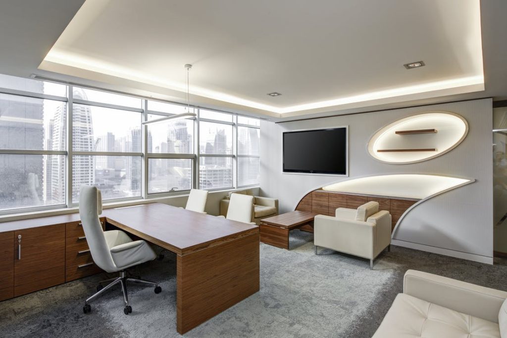
The interior design of any space – whether it be apartments, offices, or the local store – is often extravagant within movies and TV. Budgets seem not to apply to characters in these settings, which is envious to us as viewers but allows us to relish in the incredible office interior design that has been showcased over the years. Here are a few of our favourite examples:
Mad Men
Unsurprisingly, the Sterling Cooper Draper Pryce premises are something of a masterpiece. The mid-century design of the time is coming back around, and we’re certainly glad of that. There is an abundance of Eames furniture and abstract paintings that have a warm, vintage feel looking back in 2017. The scene of sneaking into Bert Cooper’s office to experience a Rothko is something we can all relate to…
The SCDP offices in the Time & Life Building are a 21st Century adaptation of 20th Century modern decor, with Knoll, Herman Miller and Steelcase all making frequent appearances in between the orange hues and confident, primary colours of the space.
Interestingly, the office interior design is far more than just aesthetic in Mad Men, with metaphoric references running parallel alongside character developments. This is clearest with Roger Sterling’s character arc from Sterling Cooper, to Sterling Cooper Draper Pryce and beyond. Initially, Roger is surrounded by a classic, mod design that is contemporary, composed and symmetrical. Yet, as the story progresses and so does his self-enlightenment, his second office space is filled with futuristic furniture and pop art.
The Intern
The startup space is riddled with exquisite office interior design, and this is represented in the 2015 film ‘The Intern’. The fashion startup headed by Anne Hathaway as Jules employs a stylish office space that makes the most of a renovated, Brooklyn factory. Making the most of expansive windows and painted brick is a staple of modern envy since we all want to combine the industrial visuals of a disused factory with mid-century furniture, bright whites and plenty of glass.
The set designers for this space managed to utilise glass perfectly with the conference rooms being the only separated spaces, adding some structure to the office interior design without compromising the natural light and character. Naturally, for this application of design, the industrial notifs of the building were complimented by gleaming white desks and Macs, creating an interesting juxtaposition of old and new.
The designers of the space for the movie managed to replicate the real spaces occupied by startups of a similar ilk and removed themselves from the standard movie tropes by implementing products that a startup of the size and budget of ‘About the Fit’ could actually afford.
Honourable Mentions
Some of the honourable mentions from the office interior design space in movies and television include the likes of The Devil Wears Prada, Suits and American Psycho. These moving images certainly represent some of the height of design that you can cite for inspiration when designing, or redesigning, the space for your company.
Interior design is such a fascinating area of expression, so it’s intriguing to dissect and appreciate the workplace of some of media’s heroes, anti-heroes, and biggest personalities. Arguably, we might be biased with the modern aesthetic, forgetting to mention some of the classical – and realistic – applications in House of Cards and Office Space, but taste is subjective.
If you’d like to hear about the office-related services we provide here at Wessex Interiors, which includes refurbishments, mezzanine floors, relocation and more, please get in touch. You can call us on 02380 663 100 or fill out our simple, online contact form and one of our friendly members of staff will be happy to help.
